

The art of the vignette: styling shelves, consoles and coffee tables
A vignette is a small, intentional arrangement on a shelf, console or coffee table that helps a room feel considered. Think of it as a tidy little story: a few pieces, thoughtfully grouped, that draw the eye and set the tone for the space. But how do you know what to pick, where to place it, and when to stop?
This guide covers the essentials: choosing a focal point, balancing height and texture, keeping a tight colour palette, and using lighting so everything feels cohesive and intentional. It also includes repeatable formulas and quick recipes to copy, plus easy ways to link styling back to the room’s backdrop. From your walls, to your lighting and even your home’s flooring, there’s plenty you can do to create a cohesive space that doesn’t feel staged.
Set the foundation for success
Before hunting for décor, glance at the bigger picture. What colour is the room trying to be? Where does light fall? What sits underfoot? Floors aren’t the “star” of the vignette, but they do set the tone. By letting them guide your palette up at shelf or table height (for instance with a timber frame or stone bookend) everything will start to gel.
If you’re mid-reno or refreshing a tired room, start by locking in larger surfaces and their tones. Laminate flooring is a great way to establish a clean, consistent base note without high maintenance, just choose a colour that aligns with your palette, then echo that hue once or twice at eye level. Keep the wall colour simple, let the floor be your anchor, and let the vignette echo, not compete.
Colour, texture and the “feel” of the room
Let’s start light and easy: fewer colours, more texture. Two base tones (usually pulled from floor and wall) plus one quiet accent is plenty. When in doubt, repeat the same few materials, such as ceramic, glass, timber or stone, so the eye relaxes.
Now think about the mood.
- Pale floors? Keep it airy with clear glass, pale stone and blonde timber.
- Mid-tones? Add a little bite with a black frame or inky bowl.
- Dark floors? Balance the weight with lighter ceramics and a touch of soft shine.
Texture does the heavy lifting here. Matte ceramics, ribbed glass, nubby linen can all give interest without turning your palette into confetti.
Anatomy of a great vignette
If you’ve ever asked “Where do I even start?”, this is the bit to copy. Here is what you need to keep in mind whenever you’re designing a vignette:
- Begin with a base. A tray instantly corrals small things. On shelves, a flat book stack works like a tray; on consoles, a simple runner breaks up long lines.
- Add a tall, a medium and a low. Tall (branch, lamp), medium (bowl, lidded box, book stack), low (candle, small stone). Three to five pieces total is enough.
- Mix shape and shine. Pair round with linear, soft with structured. Keep most finishes matte, then add one metallic accent—say a brass bowl, blackened-steel candlestick or a small tray—for a quiet spark.
Styling shelves without the clutter
Shelves are where “collected” can turn into “chaotic” in about five minutes, so ease in with a plan. Start by thinking in zones, not rows, treating each bay (or even each third of a long shelf) as its own little composition. When you repeat one element every couple of bays (say rattan baskets or slim black frames) the whole bookcase feels stitched together rather than busy.
Next, edit the spines. Group books by tone for a calmer read, then mix directions: some standing, some stacked. Bookends that echo your room’s materials will also quietly ground the scene and link it back to the space. And finally, leave some air. Negative space is part of the design; if every shelf is full, nothing lands.
Quick shelf formulas:
- Vertical books + low bowl + tiny object on a tray.
- Horizontal stack + small frame leaning + bud vase.
- Basket (function) + book stack (height) + candle (warmth).
Consoles that greet without shouting
If your hall table has become a drop zone, start with a quick reset. Clear it, then give the surface a purpose so it feels welcoming again.
Begin with a backdrop. Hang art or a mirror about two thirds the width of the console. It sets the scale, reflects light, and even picks up a hint of the floor. Next, balance the ends: a tall lamp or vase on one side, a lower stack and a sculptural piece on the other. Slide a shallow tray to the centre for keys and mail so it stays useful and tidy.
Now tie it to what’s underfoot. Warm floors like to be echoed once, perhaps in a timber frame or a woven basket. Cooler floors pair well with stone, smoked glass, or soft black. Whatever your flooring colour, mirror a softened version of its tone in your tray or picture mounts so the console styling links quietly to the rest of the room.
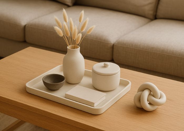
Coffee tables that actually work
Coffee tables are famous for collecting clutter. They live between a practical space and a focal point, so give them a simple plan.
Start by dividing the surface into rough quarters in your head. Fill two or three with styled pieces and leave one clear for cups, remotes, and real life. That single clear patch makes everything feel intentional.
Keep sightlines open. Let your tallest item sit below seated eye level so you can still see across the room. Low florals, a lidded bowl, or a sculptural candle add interest without building a wall.
Finally, add a base to corral the small stuff. A tray pulls pieces together and makes tidying quick. Then mix a few opposites for texture and balance. Smooth table, try a linen-bound book, a matte ceramic, and a touch of glass. Strong grain or lots of pattern, keep tabletop textures quieter so nothing competes.
Quick coffee-table recipes:
- Rectangle: a large tray with a candle and lidded box, plus a two-book stack in the opposite corner topped with a small stone.
- Round: a central tray with a curved vase, plus one off-centre sculptural object like an orb, knot, or bowl.
Personal stories beat generic props
The most memorable setups feel personal, not just pretty. A vignette lands when it says something about you, so take the time to add part of your personality to your creations.
Pick one or two meaningful pieces, like a handmade ceramic, a travel memento or a favourite photo, and surround them with simpler “support acts.” Love a shape? Repeat it in different materials: an arched bookend, a curved bowl, a print with a soft arch. Repetition keeps it cohesive; variation keeps it interesting.
Bring it together
Vignettes work best when they feel simple and considered. Start with the foundation you’ve set, build small moments that echo it, and keep to a tight palette that repeats tones from your floor and walls. Keep most finishes matte, add a touch of shine, and let a little empty space do its job.
On shelves, think in zones so each bay reads clean. On consoles, give the surface a purpose with a backdrop and a balanced pair of ends. On coffee tables, keep one quadrant clear so real life still fits. Do that, and your styling reads as part of the room rather than extra stuff sitting on top of it.
Ready to refresh a corner? Start small, try one of the quick formulas, and adjust until it feels like you.


